

In this blog post, I’ll walk through where Oxy’s branding started and how we interpreted vision into our own visual language.
Vision
Data intelligence has evolved from manual analysis to one that is AI-augmented and autonomous data over the past decade, fundamentally changing the way organizations process and consume data. Today, enterprises require sophisticated data agents capable of autonomously surfacing meaningful insights from complex datasets beyond simple data extraction.
Oxy is a novel agentic analytics platform that enables users to build sophisticated data agents and get valuable insights from their enterprise data.
Our team's unwavering commitment to accurate data insights and helping leverage data teams is driving a new world where data agents work seamlessly alongside human workers, enhancing rather than replacing human capabilities.
Visualizing data insights

The brand team’s challenge was to craft an identity that embodies Oxy's forward-looking vision while establishing clear product differentiation in the competitive data intelligence market.
Oxy enables users to create a semantic model and test their agents in production, ensuring these agents can effectively reason through enterprise data while maintaining precision and accuracy.
We wanted to visually represent the transformation of raw data into structured data insights through a visual representation that we call “cubic data transformation”. This visual evolution symbolizes the potential of Oxy’s data insights engine and the uniqueness of each insight as a distinct, valuable creation.
Brand elements
Cyber-futurism: Our Visual DNA

Building on our core concept illustrated above, we developed a distinctive aesthetic to create Oxy's brand identity.
We call our aesthetic “Cyber-futurism”. Cyber-futurism is a visual representation of the data-intelligent future Oxy is pioneering. This approach aligns with our cutting-edge technology while creating a distinctive visual language in the enterprise data space.
The deliberate fusion of 3D volumetric elements with grid-based design creates a systematic, technical foundation that reinforces Oxy's commitment to accurate insights.
These design choices establish a cohesive visual system where the transformation from raw data to cubic insights feels natural and intuitive.
Logo
Our logo is a combination of the letter ‘O’ and cubes (see “cubic data transformation” above). The smooth, sculpted cubes on the top right demonstrate Oxy’s adaptability to various user use cases.
Typography
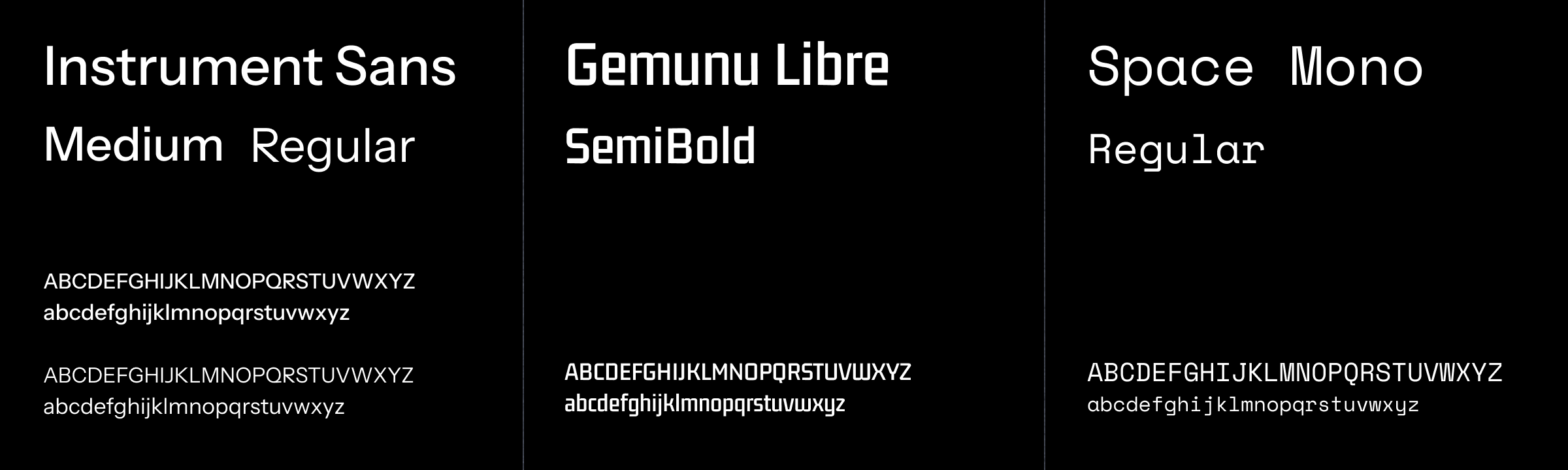
We curated a functional yet expressive type system to support diverse use cases:
- Instrument sans: Our primary typeface, chosen for its balance of legibility and subtle technical character.
- Gemunu Libre: Used for titles and headlines, this bold typeface anchors our unique aesthetic and commands attention.
- Space mono: Used in interface elements like buttons, it evokes command-line environments and reinforces one of our core surfaces.
Ending note
The Oxy brand identity isn't just a visual system—it's a promise to our users. Each grid, each cube, and each transformation represents our commitment to advancing data intelligence with purpose and precision. As we continue to pioneer this new frontier, our brand will evolve alongside our technology, maintaining the balance between mathematical integrity and real-world impact.

